Disabling ligatures (see Calimo's fonts.conf answer) is the wrong direction! It may remove those over-aliased "bold" ligatures in fonts like Calibri, but it also removes some of the beauty of typography. That's rather similar to shrinking the font until you can't tell the difference.
I solved this for my system by removing the Calibri font, installing Carlito, which is "metric-compatible with Calibri" and is packaged with "a mapping entry to fontconfig (local.conf)," and refreshing my font cache:
$ rm ~/.fonts/microsoft/CALIBRI*
$ sudo apt install fonts-crosextra-carlito
$ fc-cache
You can then verify that Carlito stands in for Calibri:
$ fc-match Calibri
Carlito-Regular.ttf: "Carlito" "Regular"
(If this doesn't work, you may need something like sudo rm /usr/share/fonts/truetype/msttcorefonts/calibri* though the case and exact location may differ.)
Before removing Microsoft's Calibri, I saved a test document in LibreOffice that used Calibri and took a screen shot. After doing that, I quit LibreOffice, opened it again, and then loaded my test document. The "Calibri" font name was italicized to indicate that it was substituted for. I took a screen shot of this substituted version and pasted it below the original:
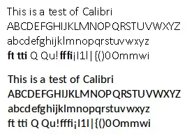
The above text is a pair of screen shots of 13pt Calibri, with Microsoft's Calibri above Carlito as matched by fontconfig. There is no bold, no formatting, "pair kerning" enabled, as rendered by LibreOffice 5.0.5.1.
Carlito is quite close to Calibri, ligatures render properly, and it's much prettier overall.
You can do the same with Caladea for Cambria with fonts-crosextra-caladea and you can use Google's Croscore fonts Arimo, Tinos, and Cousine for Arial, Times New Roman, and Courier New with fonts-croscore. Learn more at Debian's Substituting Calibri and Cambria Fonts wiki.
But what about Helvetica?
This question asks about the Helvetica font, which is Apple's preferred sans-serif font. Microsoft preferred Arial before it changed to Calibri. The default Linux mapping varies by distribution, but it's typically either Nimbus Sans L or else Liberation Sans, e.g.
$ fc-match Helvetica
n019003l.pfb: "Nimbus Sans L" "Regular"
If you run that and get Arial, that's a pretty good reason for having the ligature issue described above – Arial is not a great font.
Helvetica has quite the culture surrounding it and I can't find a font that is fully metric-compatible with Helvetica. Arial (and fonts metrically compatible with Arial, including Liberation Sans and its fork, Arimo, have identical character widths (which mean they're "mostly" metric compatible; text will wrap the same way as with Helvetica). Among the free fonts, Liberation Sans and Nimbus Sans seem to have the most similar aesthetics.
There's also IBM Plex, a new font with big money behind it[1][2]. Plex is designed to replace Helvetica (it also has condensed sans as well as serif and monospace fonts) in all of IBM's materials, though it is not at all metric-compatible to Helvetica or other fonts. Font Squirrel has a nice view of samples of the Plex fonts.
Fontconfig aliases
To manually alias Helvetica to another font (and therefore not need to remove Calibri and/or Arial, though in that case you should also manually alias those), edit your ~/.config/fontconfig/fonts.conf file (for older systems, that's ~/.fonts.conf. To avoid confusion, I symlink the latter to the former) as noted in this answer, adding a new <alias> section for Helvetica (this one uses Arimo. Make sure you have it installed):
<?xml version='1.0'?>
<!DOCTYPE fontconfig SYSTEM 'fonts.dtd'>
<fontconfig>

  <alias>
    <family>Helvetica</family>
    <prefer><family>Arimo</family></prefer>
  </alias>

</fontconfig>