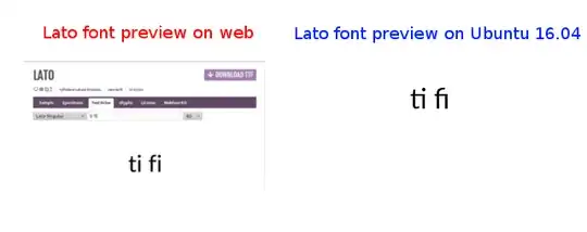
I'm using Lato font on Ubuntu 16.04.
Why is the gap of character "f" and "i" or "t" and "i" too narrow ? On the web, it is displayed as expected.

Any suggestion?
One idea is to raise the precedence. Create the file ~/.config/fontconfig/conf.d/10-prefer-lato.conf and give it this contents:
<?xml version="1.0"?>
<!DOCTYPE fontconfig SYSTEM "fonts.dtd">
<fontconfig>
        <alias>
                <family>sans-serif</family>
                <prefer>
                        <family>Lato</family>
                </prefer>
        </alias>
</fontconfig>