Note, that for dynamical spacetimes such as black hole collapse models the shape of Penrose diagram is not unique depending on which part of spacetime is put at its center. This is illustrated by multiple variants of Penrose diagram for Oppenheimer–Snyder collapse presented in Andrew Hamilton's book General Relativity, Black Holes, and Cosmology (Fig. 7.20)
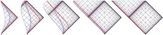
Here, thin purple lines are curves of constant time, while thin violet lines are curves of constant $r$, while the outer boundary of collapsing dust cloud is thick red line.
A precise depiction based on explicit coordinate transformations would be ideal …
Algorithms for explicit calculation of Penrose diagrams are discussed in this paper:
This paper contains multiple examples of Penrose diagrams, including those for collapse of thin shell of “null dust” into a black hole:
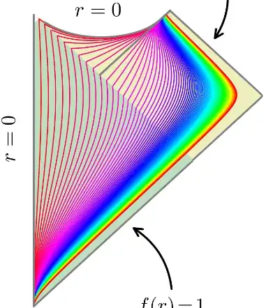
Thin lines are curves of constant $r$, while the authors do not bother with curves of constant time, possibly because for dynamical spacetimes definition of time coordinate is inherently ambiguous, whereas radial coordinate is defined unambiguously for spherically symmetric spacetimes.
Python code utilized by this paper is available on GitHub but (currently) there seems to be almost no documentation.
Bonus points for the case of the evaporating black hole …
The authors of the above mentioned paper (with another researcher) also calculated multiple Penrose diagrams for various models of black hole evaporation:
The simplest such model (single null shell collapses into a black hole and subsequently evaporates in a single burst of Hawking radiation) corresponds to these diagrams:
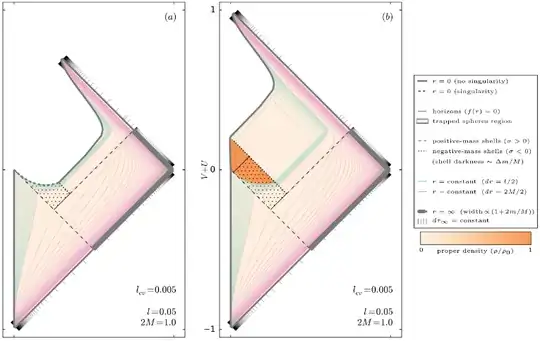
Thin lines are lines of constant $r$, green for $r<r_s$, pink for $r>r_s$. Two diagram variants correspond to black hole with central singularity (left) and without a singularity (right).


