13

What are the known methods for visualizing quantum states of one-dimensional spin chains? They can be based either on their wave functions or density matrices.

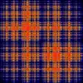
My particular interest is in plotting eigenstates of 1D spin chains (e.g. Heisenberg model) in a way in which correlations between particles are related to the self-similarity of the image.

As a side note, I found a Wikipedia Commons image with its description on the topic (a thumbnail below). However, it is not supported neither by a peer reviewed publication nor by a decent preprint. The only text related is extremely drafty.

However, I'm the most interested in published results, and even more when they relate properties of the image to the properties of the state.
enter image description here

Piotr Migdal
  • 6,530

3 Answers3

8

You seem to be answering your own question. Obviously there is far too much information to represent in a reasonably sized 2d or 3d plot, so no matter what you do, you will be losing something. If you want a plot that shows correlations between particles, you can do just that: For a spinchain of $N$ sites, create a $N\times N$ image, where the value of the pixel at each point $(i,j)$ is given by the expectation value of the operator $\sigma^A_i \sigma^B_j$, where $\sigma^{A/B}_{i/j} \in \{\sigma_X, \sigma_Y, \sigma_Z\}$. This gives you 9 possible plots.

It seems likely that you may only care about the case where $\sigma^A = \sigma^B$, in which case there are only 3 plots, and you could take the expectation values for $XX$, $YY$ and $ZZ$ as the R, G and B values for a colour plot.

This kind of thing produces things very similar to the type of plot you have in your question.

6

The image you have posted looks like a recurrence plot to me. It is primarily used to visualize correlation information in time-series data, but it can be used with any discrete set. A particularly good source of information is this website.

rcollyer
  • 923
5

This isn't really an answer on its own, more an addendum to Joe's...

You are not, I think, going to find a "detailed analysis" of how correlation function have been plotted in most papers. Your best bet is to look at various examples - Nature and Science papers will be most helpful for this, as they are heavy on the graphical representation and have space for lots of supplementary material.

A good example of the sorts of plots Joe talked about, in sets that make it easy to see the transitions, is http://www.nature.com/nphys/journal/v7/n5/fig_tab/nphys1919_F6.html