You're confusing a specific visual representation of the top bid & ask orders selected from the order book with the actual "top of the book". "Top" in the sense of the "top of the book" is a ranking (by order of "best", different for bids vs. asks) and not meant to be strictly a visual positioning on a page or screen.
The data in the visual representation comes from the top of the order book (the best bids, and the best asks), but that visual representation is choosing to present it in a specific way.
Think of the "book" as the model, the abstract collection of outstanding bid and ask order data. When people talk about the "top of the book", they're talking about the best bids (higher being better), and the best asks (lower being better).
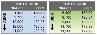
The visual representation above is but one possible way to render a tip-of-the-iceberg view of the best orders in the "book". The advantage of that particular visual representation is that one can see the asks & bids converging towards the center. The spread is visible as the difference between the two middle elements – being the lowest row in the blue "Asks" area, and the highest row in the green "Bids" area.
The up-arrow they had included in the "Asks" area was perhaps meant to provide a clue about how the data was sorted contrary to expectations of descending order of "bestness", and/or to imply there is further depth to the book data in the indicated direction.
If the bids & asks had been oriented side-by-side instead, they might have chosen to represent it as below, re-arranging the rows in the "Asks" in the opposite order (i.e. in the order you had expected) so that the "bests" are both in the top row: