12

The dash provided on my laptop keyboard (-) is always marked as a spelling mistake in my Word document, no matter how I choose to use it. This is the dash right next to the 0 on the line of numbers keys. When I right-click on the 'mistake', it simply says, 'En dash or em dash:' and gives me options of another two dash types, which I presume are en and em dashes. I cannot find these dashes on the keyboard at all.

  1. What is this dash provided on the keyboard and why is it always wrong?
  2. Why has the 'wrong' one been the one chosen to go on all the keyboards, if it is always wrong? Why did they not put these two presumably 'better option' dashes on the keyboard instead?
Gemma H
  • 121
  • 4

4 Answers4

17

What is this "dash" provided on the keyboard?

What you have on your keyboard is the hyphen, which is used, among other things, to join words together (e.g. well-respected) and to signify that a word continues beyond the linebreak.

Why is the hyphen always wrong?

As I'm sure you would note if you looked at where you used it in your typing, the hyphen is correct when you join words together, break a word at a line ending, etc. It is wrong only where a dash would be correct.

The usage of the different dashes is well-explained on the Wikipedia page for dash. Among them are:

  • When a sentence breaks off (e.g. "Wait I—!")
  • To enclose parenthetical expressions (e.g. "He was – contrary to what his brother believed – a handsome man.")

For the many uses and the exact rules in the different varieties of English, please refer to the linked Wikipedia page.

Why is the hyphen on the keyboard but not the dashes?

Because the keyboard layout that we use today was developed at the time of the typewriter. Typewriters only have two characters per key, one of which is accessed using the shift key. Typewriters therefore had a limited number of characters that could be placed on their keys and a choice had to be made for the most fequent ones. Since the hyphen is visually similar to the en- and em-dash, it was decided and became the convention to use the hyphen instead of these dashes when typing on a typewriter.

On a computer, the typewriter layout has been largely maintained for compatibility reasons. Someone who can type on one should be able to type on the other, without having to learn a new layout. Therefore the additional characters, among them the dashes, that can be typed on a computer, are made available by using the control and option keys (on a Mac) or Alt and AltGr (on a PC).

Ben
  • 19,064
  • 1
  • 16
  • 72
15

What is this dash provided on the keyboard and why is it always wrong?

The symbol "-" is the hyphen. It is used to join words together ("long-running", "old-fashioned", "right-click"), to break up words into syllables ("Hermione was now teaching Krum to say her name properly; he kept calling her 'Hermy-own'."), and generally to separate or join individual words.

The literal symbol - is also used as the minus sign.

Why has the 'wrong' one been the one chosen to go on all the keyboards, if it is always wrong? Why did they not put these two presumably 'better option' dashes on the keyboard instead?

Historical reasons, mostly. On typewriters there was only one dash. Typewriters can only write in monospace fonts, so it had to be a dash the same width as a letter.

This long dash with hardly any breathing space (I think it's the em one?) looks weird, out-of-place and ugly, regardless of where it's used. Is no one else bothered by this? The one on the keyboard provided actually looks the best. It's just a pain having to keep right-clicking and changing it to get rid of that annoying wiggly line the word processor keeps bugging me with

Type two hyphens in a row and Word will replace them with a dash for you. Surround them by spaces and it'll make an en dash, join them to the words and it'll make an em dash.

The food--which was delicious--reminded me of home gives: "The food—which was delicious—reminded me of home"

The food -- which was delicious -- reminded me of home gives: "The food – which was delicious – reminded me of home"

Toph
  • 423
  • 6
2

There are, in fact, four different dash-like characters in typographic usage:

  • The hyphen (-) is used to join words for things like some double-barreled surnames (Dan Beachy-Quick), compound adjectives (double-barreled) some chemical compounds (alpha-Amanitin) and to indicate a word broken across lines (hyphenation).
  • The em dash (—) is used to indicate offset text (here—and I really mean this—is an example) and sometimes also omitted parts of words (f—k) or to indicate something has trailed off (“Are you really going to—?” she asked.)
  • The en dash (–) is used for ranges (A–Z, 1–99), compound adjectives where one or both parts of the compound are multiple words (Franz Kafka–style weirdness). In some publishers’ styles (e.g., Penguin paperbacks originally published in England), an en dash with spaces on either side is used where the em dash would be used for offsetting text. It is vital, if you do this, to use a non-breaking space before the en dash as a punctuation dash should never begin a line.¹
  • The minus sign (−) is used in mathematical contexts. Compare the distinction between -9° and −9°. Linebreaking is handled differently with − where the correct line break is before − but after -.²

As for why there’s only - on the keyboard, it comes down to history. Typewriters generally greatly limited their character selection and often omitted 1 (since a typist could use l) and 0 (since a typist could use O) and had limited punctuation marks. Rather than provide distinct opening and closing quotation marks (“…” and ‘…’), we were cursed with the abominations that are ' and ". Likewise, - was called to serve as a replacement for the hyphen, the minus sign and the en dash while -- was to stand for the em dash. This wasn’t a big deal in that typewriters were used either for ephemeral communications like letters or were meant to be used to produce a readable manuscript for a human typesetter to work from, but in the computer age, the typescript is often used as the basis for the actual final published material and it falls on the author to do it correctly.


  1. The Apple linebreaking algorithm has done this incorrectly since the first days of OS X and I suspect it will never be fixed. I’ve even seen this typographical abomination appear in printed books from major publishers. This makes me sad.
  2. Although proper typesetting also requires some care around spacing as well.
D. A. Hosek
  • 1,170
  • 4
  • 11
0

ABOUT THE DASH ON YOUR KEYBOARD . . .

Dashes on the keyboard A generic keyboard with an numeric keypad

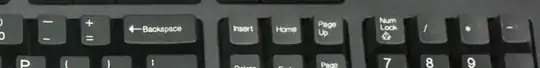
The default dash key produces a hypen (-). Different dashes are achieved by either inserting them as a symbol or using a keyboard shortcut. Alternatively, people can search for the dash via Google and copy-paste the desired dash in (changing formatting and font as needed). Some keyboards do not have additional keys or straightforward signposting of symbols.

Using shortcuts on keyboards A keyboard for a Mac computer

Modern keyboards tend to show at least two symbols on the main dash key. The lower symbol is the default symbol you achieve by pressing the key; the higher symbol on a key is the alternative symbol you achieve by pressing and/or holding other keys (a keyboard shortcut). Just as you might [Ctrl] + V to past a copied selection, you can (on a Mac) do the following:

  • Just press the dash key for a hyphen (-)
  • Hold [Option] and press the dash key for a en dash (–)
  • Hold [Option] + [Shift] and press the dash key for a em dash (—)

NOTE: I say a and not an because "a" refers to a singular quantity whereas "an" refers to a subject-context even if referring to an object (i.e. an before a vowel and silent consonant is not the correct rule, which is determined by context specific usage not "phonetics" ).

Identifying errors of usage

Word processors like MS Word have in-built correction features, which are unreliable. Just as some correct terminology will be flagged by the limitations of the dictionary is use, so too will the flagging of punctuation be limited to the basic rules applied in the software. The greater the complexity of the writing, the less reliable in-built correction software becomes because language is complex. Do not rely on the software – make your own judgement call on anything flagged. Alternatively, you can cross-reference with an appropriate style manual or just read on . . .


KNOWING WHEN A SPECIFIC DASH IS CORRECT

Types of dashes

There are three dashes used in writing: the hyphen (-), the en dash (–), and the em dash (—).

A matter of length

While a dash separates or modifies the meaning of text or numbers, it is the length of the dash that signifies how it should be read in context. Hyphens are half an en; en dashes are half an em. The en and em are units of measure. In maths, the minus symbol is represented by a hyphen and sometimes an en dash, but the latter is usually more a case of how a font may not differentiate "dash length" very well.

What is a hyphen?

A hyphen (-) is typically used to make compound words (e.g. blue-grey) where there isn't an existing one (e.g. football). Sometimes, writers will forgo the hyphen on compound words as a way of signifying to the reader a word is common in their story world (e.g. levcar).

A double hyphen (--) is a way of constructing an em dash, which has its origins in the days of the typewriter. With old typewriters, there were fewer variations of symbol and punctuation. The double hyphen has fallen out of common use, but if you do use it, then just be consistent.

Examples include:

  1. dragon-like (i.e. The statue was dragon-like)
  2. fish-that-cannot-swim (i.e. My kid was a fish-that-cannot-swim type)
  3. Smith-Doe (i.e. Jane hyphenated her name to Smith-Doe after marrying John)
  4. 0 - 4 = -4
  5. 01-01-2025 (i.e. 1 January 2025 can be written as 01-01-2025)

What about en dashes?

The en dash (–) tends to be used to strongly emphasise a point at the end of a sentence (e.g. We were ordered to kill the prisoner – I refused). In the context of quantity, it can convey that there is a range (e.g. April – June). It can also signify a connection or relationship between two distinct subjects/objects where subjects can be concrete or abstract.

A double en dash is used to represent missing letters in a word (e.g. B––t as in boat), which is typical in a game of Hangman or in word-based puzzles.

Examples include:

  1. We do not agree with simple explanations – we hate them!
  2. We are traveling 24–28 January this year
  3. The score was 4–3 and we won
  4. The parent–child relationship is varies across cultures
  5. A work–life balance is important
  6. E– d–shes (i.e. the 'n' and 'a' letters are withheld)

And em dashes?

The em dash (—) often signifies a break, break away, or interruption where suddenness can be emphasised to the reader by removing the spacing. The em dash can also be used in reversed listing rather than standard listening, which uses a colon (the first listed subject/object denoting greater importance).

A double em dash (——) can represent an omission.

Examples include:

  1. There is much in this report — forgetting your behaviour — that I like
  2. We must always be vigilant—
  3. "My favourite dash is—"
  4. The document was signed by F——
  5. Red, blue, and white — these are the colours of the American flag

Dashes in childhood education

Teachers tend not to teach variations of dashes to children in mainstream schooling. So, the hyphen is used for the en dash whereas the em dash is not taught at all. This is a failing of the education system.

Del
  • 57
  • 5