It is not frame dragging, it is a visualisation of the linear polarisation present in 230 GHz light emerging from the vicinity of Sgr A* at the centre of the Milky Way. But getting an answer took some detective work...
The press release links to a paper by the Event Horizon Telescope Collaboration. This paper present images of the region around the (very likely) black hole at the centre of M87 in circularly polarised (CP) light. The CP signature is v "both weak and sensitive to calibration errors". The CP signature is a couple of vague blobs with only very crude spatial structure at a resolution roughly similar to the Schwarzschild radius, with positive and negative CP either side of the centre. This paper does not contain the image in your press release and is nothing to do with Sgr A*, the black hole at the centre of the Milky Way.
So, after that wild-goose chase, I tracked down the correct paper, which is also from the EHT collaboration and is a study of the linear polarisation (LP) and CP present in the emission from the region immediately surrounding Sgr A*. In addition to the problems inherent to analysing the M87 polarisation data, the Sgr A* dataset is also afflicted by short timescale (20s) variability and interstellar scattering. However, they do detect a very strong LP signal and it is from this that the visualisation has been created.
It makes more sense to see the "raw" data (though note that the image has been reconstructed from interferometric data) and the visualisation together (as they are in the paper). Here it is in the top plot: They grey scale shows the total intensity of the 230GHz radiation, the tick marks show the direction of the electric field vector polarisation angle (for the linearly polarised component) and the colour scale indicates what fraction of the light is linearly polarised. The white dotted contours indicate the strength of the linearly polarised component.
The bottom plot is the image in the press release and has been created by overlaying dark "streamlines" of linear polarisation over the top of an orange-tinted grey-scale image of the total intensity, in a loosely defined way. The electric polarisation vector ticks in the upper plot have been given a length and opacity that is proportional to the square of the polarised intensity.
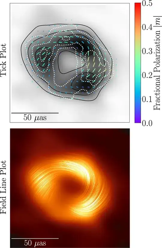
Thus the answer to your question is that this has nothing to do with frame-dragging. It is a visualisation of what the linear polarisation field looks like (the dark lines aren't "real").
Another point to mention is that the image is not a direct image of the accretion flow around the black hole. The ring-like structure is a consequence of light rays passing from material near the black hole, approaching the photon sphere at $1.5 r_s$ and being bent around into our line of sight. This ring would be seen from whichever direction we view the black hole and for any orientation of the accretion flow.

