17

The following problem has bugged me for a while, ever since I noticed it. On the Visible Spectrum Wikipedia, the following is the visible spectrum:

colour spectrum

Now, in Photoshop, or really any colour picker, the hue slider looks something like this: photoshop hue selection

Or sometimes this:

colour wheel

I noticed that in both of these, the colour loops back to red. Why is this? I believe that this doesn't happen on the visible spectrum. The visible spectrum goes from a violet-ish colour to a maroon-ish colour, with a whole range in between. But where does the magenta colour from the hue slider fit in?

I take it that it is possible to have a purely yellow object, or a purely teal one, as it is on the colour spectrum, yet are magenta things and pink flowers inherently reflecting multiple wavelengths of light, from opposite ends of our particular viewing spectrum? All of this seems awfully odd to me, so I was hoping someone might be able to clear it up.

Qmechanic
  • 220,844

3 Answers3

26

The monochromatic spectrum and the hue wheel are different 1D paths through 3D color space

Since human color vision involves three types of cone cells, all the colors a human can see can be represented as a region of 3D space.

The most straightforward of these spaces is LMS space (long, medium, and short wavelength), where the coordinates of a point in space represent the stimulation of each type of cone cell. LMS space can be transformed with a linear transformation to the more convenient XYZ space. The axes of XYZ space were chosen to have useful properties, but for our purposes, it just produces nicer looking plots. Note that not all points in LMS space or XYZ space represent colors humans can see; for instance, a cone can't be stimulated by a negative amount.

The below "chromaticity diagram" is a plot of a 2D slice of XYZ color space in the plane $X + Y + Z = 1$.

chromaticity diagram

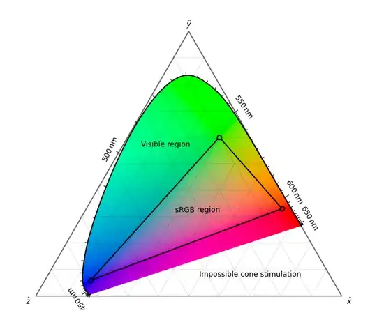
The colored region of the plot, label "visible region", contains points in the space representing colors humans can see, while the non-colored region contains points representing physically impossible cone stimulations. The top edge of the colored region corresponds to monochromatic colors. The circled vertices of the triangle labeled "sRGB region" represent the red, green, and blue primary colors used by an sRGB monitor, and the edges and interior of the triangle are linear combinations of the primaries. Note that only colors in the sRGB region can be reproduced by an sRGB monitor, so colors outside the region in the diagram are clamped to nearby sRGB colors.

Finally, the answer: the visible light spectrum is the non-closed path along the top edge of the colored region, and the hue wheel is some closed path through the colored region. The exact path of the hue wheel varies, but it is often chosen to be the perimeter of the triangle defined by the three sRGB primaries.

Notice that the bottom edge of this triangle approaches the bottom edge of the colored region, which does not represent monochromatic colors, but instead combinations of red and blue, giving magenta.

Vaelus
  • 613
10

The reason that color wheels are so common is that when certain colors are absorbed by materials, and thus not effectively reflected back towards a human's eyes, humans tend to perceive the material as being the "complementary color" on the opposite side of the color wheel to the color absorbed. This, as you rightly pointed out, has nothing at all to do with the actual electromagnetic frequencies of the light itself. Rather, it has to do with the peculiarities of how sensitive the human eye's distinct cell receptors are to different frequencies of electromagnetic spectrum. The three cell types, represented by the three distinct curves on this graph, have the color perception sensitivities shown.

Sensitivites of eye cells to electromagnetic frequencies taken from https://www.researchgate.net/figure/The-three-color-systems-in-normal-human-color-vision-2_fig4_323084928

The total obtained by adding up the various contributions of these curves looks like the following figure.

Total spectral sensitivity of the human eye taken from https://en.wikipedia.org/wiki/Color_vision

It just so happens that when you absorb, e.g. red light, that the majority of the intensity remaining will tend to be of greener color than anticipated, making you perceive the complementary color green. Likewise, when green colors are absorbed, the remaining colors are mostly red, making you perceive the complementary color red. The color wheel just neatly organizes this otherwise highly unintuitive information for us.

color wheel image taken from https://www.hgtv.com/design/decorating/design-101/color-wheel-primer

Rather than display the raw electromagnetic spectral values of colors, which is far more useful to a physicist, color wheels show us the relationships between colors as humans actually perceive them, which is far more useful to an artist, for instance. Of course, the fact that these are continuous spectra and the fact that materials can absorb to different degrees over wide varieties of wavelengths can make the actual prediction of optical properties of materials quite difficult a priori. This is just a useful heuristic for simple examples.

Matt Hanson
  • 3,857
6

The reason for your confusion is that color words are used in two incompatible ways.

  1. Humans with standard trichromatic vision have three types of cones. The outputs of the three types of cone can be seen as coordinates in a three-dimensional space of colors. Any beam of light has a single color, which is a function of the cone response it produces if you shine it into someone's eye. Magenta light exists; otherwise we wouldn't see that color.

  2. Unfortunately, people also use color names like red and blue for single frequencies of light. They call a light beam whose Fourier spectrum has one narrow peak "monochromatic", and they say that a light beam with two peaks in the Fourier spectrum has two colors, even though you will see only one color when you look at it, and that color is not either of the two colors they assign to it.

This leads to endless confusion, including the idea that magenta is not a real color (just because there isn't any single frequency of light that can be given the name magenta in the second scheme).

In the rest of this answer I'll use color words only in the first sense.

Practically every colored object in nature, whether it's teal or magenta, reflects (scatters) a wide range of frequencies of light. The color of the scattered light is no less "pure" for all that.

Teal and magenta do differ in that teal can be produced by light with a single local maximum in its Fourier spectrum, while magenta needs two local maxima, or at least a local minimum in the middle of the visible range. That's quite different, though, from saying that teal is a single frequency and magenta is two frequencies. They aren't one frequency or two frequencies; they are colors.

We evolved color vision to see ripe fruit and saber-toothed tigers, not rainbows (probably). In terms of Fourier spectra, a rainbow is simple, but perceptually, it's a sort of random walk through the 3D color space. It could make it around the whole hue wheel, but happens not to—this is more or less an accident of how the cone pigments work. It could stop and reverse direction on the hue wheel, and I think it actually does do so at the long-wavelength end, but the colors are so dim there that it's hard to see.

Beyond that, see Vaelus's answer—but where it says "monochromatic", think "Fourier component".

benrg
  • 29,129