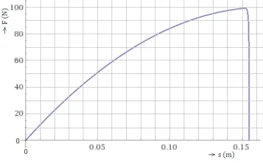
I'm making a set of exercises as part of a college project, aimed at 4th year middle school physics. In an exercise on spring constants, i used balloon inflation as a new example, i made the following graph:
where s denotes radius (perfect sphere). The sharp slope at the end is caused by the balloon exploding, hence no force remains. I'm unsure whether this graph is realistic however. I think the slope should actually increase, as the force has to be spread out over 2 directions, instead of 1 in a spring (straight diagonal line). So on that basis, this graph isn't realistic, right?
I don't want to make another graph however. So i was wondering whether I could justify it if i add that the rubber of the balloon gets weaker/thinner (or: the spring constant of the rubber decreases) as it stretches. Or would the graph still make no sense then?
Edit: my main question: could this graph be realistic for a balloon being inflated. Here F is the force required by the person inflating the balloon, or more precisely the total force distributed over the balloon. Or should i really replace it with a quadratic shape (so graph^(-1))?
