7

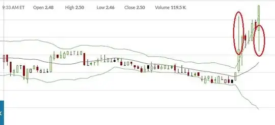
The image at the bottom shows the price of a particular stock earlier today on a red/green candlestick chart.

Some of the candle bodies have thin lines ,circled in red, sticking up (circled on one candle) and down (circled on another candle). There are also cases where the body and the lines are red instead of green.

The questions I wanted to ask:

  1. What kind of activity do the long candle-lines upward and downward from green candles correspond to?
  2. What kind of activity do the long candle-lines upward and downward from red candles correspond to?
candlestick chart

user100487
  • 884
  • 1
  • 9
  • 15

2 Answers2

10

The "fat" part of the candlestick represents the beginning and ending prices. If the end price is higher than the beginning price the stick will be colored green. If the end price is below the beginning price the stick will be colored red. Typically green sticks are hollow and red are filled in so that up and down movements can be distinguished when shown in black-and-white (or for the color blind)

The "wicks" represent the high and low prices during the period

So the wick at the bottom shows trades that were made below the open (or close) price, and the wick at the top represents the trades that were made above the closer (or open) price.

D Stanley
  • 145,656
  • 20
  • 333
  • 404
0

Couldn't be simpler:

means there was a large range of prices that day.

Fattie
  • 13,940
  • 4
  • 34
  • 60