5

I've used the "Reports and Graphs" section of Quicken in a very basic capacity to see where my money has been going -- "Income / Expenses" and "Spending by Category" mostly -- and I've been trying to branch out and try the other reports/graphs to get a better idea of my finances.

Here's what I'd like to do: See a simple graph that shows how much of my money went to Savings each month.

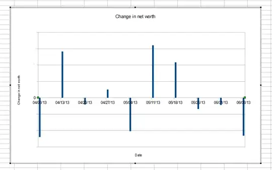
The closest I've found is the "Net Worth" chart, where the amount it goes up (or down) is the amount I've saved (or overspent). I'd like one that shows (Total Income - Total Expenses) over time. I've also tried the "Income/Expense" Graph, but that shows separate bars for income and expense, and I want to show a single bar (or a line graph would be nice too).

Tim
  • 61
  • 5

2 Answers2

1

I found a way to do this, but it's slightly backwards.

Quicken does not allow you to make a graph of just your income, probably because that would be a fairly boring graph for most people. But it does allow you to do a graph of your expenses. Doing so, while including income categories, will produce the graph I want, but with negative numbers (savings is negative spending).

  • Go to Reports -> Reports and Graph Center in the main menu.
  • In the Quicken Standard Reports section, go to Spending by Category
  • Click the Customize button.
  • On the Customize Spending by Category window, on the Categories tab, add all Income and Expense categories (but no Bank categories).
  • Click Show Graph.
  • Set the Column to Month. This will switch it from a pie chart to a bar graph

This will show a bar graph of overall spending, counting income as Negative Spending. So, having negative bars is good in this case.

Tim
  • 61
  • 5
0

I looked around and I don't think there's any way to do what you want completely in Quicken. This should get you the graph, though:

  • Go to Reports -> Reports and Graph Center in the main menu.
  • In the Quicken Standard Reports section, go to Net Worth.
  • Click the Customize button.
  • On the Customize Income/Expense by Category window, on the Accounts tab, click Clear All, and add back in the account(s) you want to track.
  • Click Show Report. Adjust the dates and periods to what you want (weekly, monthly, etc.)
  • Click Export and select Copy report to Clipboard.
  • Fire up your favorite chart-capable spreadsheet program (I used OpenOffice Calc) and paste the report in.
  • Now, create the change in net worth using the net worth figures. This is just a difference from period to period.
  • Create your chart of dates vs. this difference data (line chart, bar chart, etc.)

Here's what mine looked like (I whited out the numbers on the vertical axis):

Change in net worth

Once this is done, it's faster in the future to add data to this chart.

mbhunter
  • 24,840
  • 2
  • 50
  • 88