12

Apologies if this is a dumb question but:

Why do price charts for securities like stocks and foreign exchange always show the actual price numbers instead of charting everything in terms of percent change?

The measure of how much the price changed during any period is infinitely more important than the price itself, since that's how money invested in the security is gained and lost. And it's the only way to do technical comparison of more than one security. So, why is it not the convention to chart the percent change rather than the price?

themirror
  • 249
  • 2
  • 3

3 Answers3

4

The actual price is represented on charts and not the change in price as a percentage, because it is the actual price which is used in all other parts of analysis (both technical and fundamental), and it is the actual figure the security is bought and sold at. A change in price has to be relative to a previous price at a previous time, and we can easily work out the change in price over any given time period.

I think what you are concerned about is how to compare a certain actual price change in low priced securities to the same actual price change in a higher priced securities.

For example:

  • $1.00 rise in a $2.00 stock representing a 50% increase in price;

    vs
    
  • $1.00 rise in a $10.00 stock representing a 10% increase in price.

On a standard chart both of these look the same, as they both show a $1.00 increase in price. So what can we do to show the true representation of the percentage increase in price?

It is actually quite simple. You view the chart using a log scale instead of a standard scale (most charting packages should have this option). What may look like a bubble on a standard scale chart, looks like a healthy uptrend on a log scale chart and represents a true picture of the percentage change in price.

Example of Standard Price Scale VS LOG Price Scale on a Chart

Standard Price Scale enter image description here

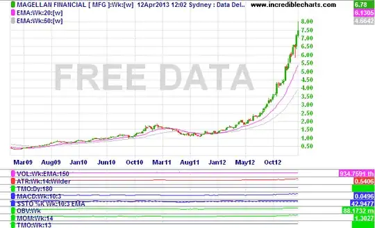
On the standard scale the price seems to have very little movement from Mar09 to Jan12 and then the price seems to zoom up after Jan12 to Mar13. This is because a 4% increase (for example) of $0.50 is only $0.02, whilst a 4% increase of $7.00 $0.28, so the increases seem much bigger at the end of the chart.

LOG Price Scale enter image description here

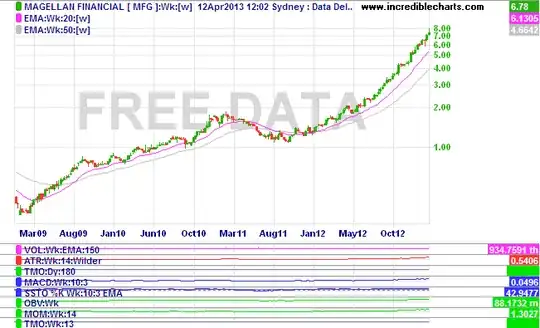
On the LOG chart however, these price changes seem to be more evenly displayed no matter at what price level the price change has occurred at. This thus give a better representation of how fast or slow the price is rising or falling, or the size of the change in price.

Victor
  • 20,987
  • 6
  • 48
  • 85
2

Actually, total return is the most important which isn't necessarily just price change as this doesn't account for dividends that may be re-invested. Thus, the price change isn't necessarily that useful in terms of knowing what you end up with as an ending balance for an investment.

Secondly, the price change itself may be deceptively large as if the stock initial price was low, e.g. a few dollars or less adjusting for stock splits as most big companies will split the stock once the price is high enough, then the percentages can be quite large years later.

Something else to consider is the percentage change would be based on what as the initial base. The price at the start of the chart or something else? Carefully consider what you want the initial starting point to be in determining price shifts here as one could take either end and claim a rationale for using it.

Most people want to look at the price to get an idea of what would X shares cost to purchase rather than look at the percentage change from day to day.

JB King
  • 10,166
  • 1
  • 21
  • 29
1

I am in complete agreement with you. The place i have found with the sort of charts you are looking for is stockcharts.com.

To compare the percentage increase of several stocks over a period of 2 market-open days or more, which is quite useful to follow the changes in various stocks… etc., an example: Here the tickers are AA to EEEEE (OTC) and $GOLD / $SILVER for the spot gold / silver price (that isn't really a ticker). It is set to show the last 6 market days (one week+)...the '6' in '6&O'. You can change it in the URL above or change it on the site for the stocks you want... up to 25 in one chart but it gets really hard to tell them apart! By moving the slider just left of the ‘6’ at the bottom right corner of the chart, you can look at 2 days or more. For a specific time period in days, highlight the ‘6’ and type any number of market-open days you want (21 days = about one month, etc.). By setting a time period in days, and moving the entire slider, you can see how your stocks did in the last bull/bear run, as an example. The site has a full how-to, for this and the other types of charts they offer. The only problem is that many OTC stocks are not charted. Save the comparison charts you use regularly in a folder in your browser bookmarks. Blessings. I see the entire needed link isn't in blue... but you need it all.

JoeTaxpayer
  • 172,694
  • 34
  • 299
  • 561
K Will
  • 11
  • 2