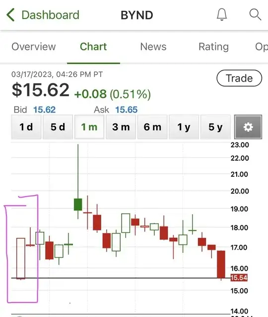
Just checking the stock BYND over 1 and 3 month periods I noticed that the same day was given a green or red candle depending on the length of the chart chosen. Am I missing something that is causing me to read the data wrong? This is likely. OR is there something wrong with the chart being produced by TDA? It’s my understanding that that candle is from 2/15/23 as shown in photo 3.
Has anyone else seen this scenario?
1 month view with stock showing a red loss for the day:
3 month view with same day showing a gain for the day:

zoomed in on the 3 month chart to show date:
