3

I'm confused at what the Y-axis of Robinhood's account graph represents. It is not labeled.

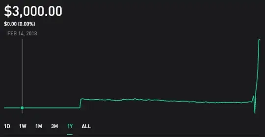
It's showing $3,000 when hovering over a date well before I ever created an account on robinhood. I would expect this number to be $0.

enter image description here

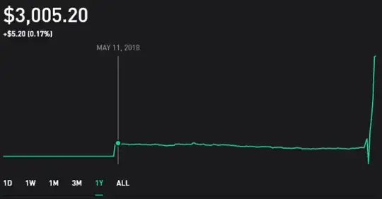
In May 2018, I signed up for Robinhood and got one free stock worth around $5. It's showing $3,005.20 on my join date. I only expect the $5 free share to be there.

enter image description here

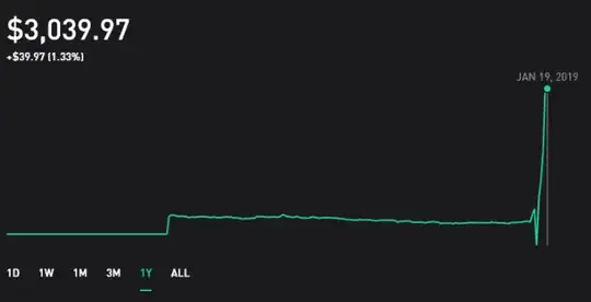
I didn't use Robinhood for the rest of 2018. Only in January 2019 did I transfer $3,000 in funds into Robinhood. I spent about $2000 on stocks within a week. This very last Y-axis number of $3,039.97 makes some slight sense to me. I bought at a local minimum and the stock market did increase ever since, probably by that $39.97 amount.

enter image description here

In other brokerage websites such as Fidelity, the Y-axis of the account graph is easier to understand. It is usually your cash + market value of investments. So you'll see blips when you fund the account from your bank. However, Robinhood seems to be showing only market value increases minus cash deposits. It's all very unfamiliar to me, so I wanted to ask this community to verify what exactly this is.
JoJo
  • 672
  • 7
  • 12

3 Answers3

2

The graph does not represented the balance of your account over time.

So, basically the flat line at the beginning doesn’t represent an actual dollar amount. The flat line represents the performance of your account before it was created.

I believe most brokerages (including Robin Hood) depict the performance of your account(s) with this graph. I asked e*trade this exact same question, and they answered all my questions, but they would not provide me with the precise formulas/algorithms used to create the graph.

The key difficulty all brokerages have in presenting this graph is this: How do you track performance of the investments over time when the client is making deposits or withdrawals?

The software algorithm is non-trivial, because deposits and withdrawals have no impact on the performance of your account.

In order to draw that graph, they need to start with the final account value, and then work backwards in time. Each time a deposit or withdrawal happens, they need to make an adjustment that goes something like this: “the $1000 that was deposited affects the performance graph only after it was deposited”.

Before the $1000 was deposited, the graph represents the performance of the account up to that point, so you should not see the graph suddenly “jump” by $1000 when you deposit $1000.

I downloaded my data and created a spreadsheet in order to verify the accuracy of e*trades performance graph. I was able to verify that their graph was exactly correct, based on the assumptions I outlined above.

(Let me know if you think other brokerages graphs are different.)

Keith Knauber
  • 408
  • 2
  • 6
0

That screenshot seems like it's showing your balance with the top figure.

The lower figure shows your growth of the $5 so far, thus neither seem to show you balance in May. I believe the chart is a relative representation - the lowest point being $0 and the highest being your highest balance - which is your current balance at the moment - $3005.20

d4c0d312
  • 101
  • 1
0

Robinhood gave you one free share of stock worth $5 when you opened the account. That's the blip up in the graph. For the rest of the year, the graph 'squiggled' horizontally as your share varied in price. In January 2019 you added $3,000, causing the graph to shoot upward. Your account should be worth $3,005 more or less, depending on the value of your one share.

If the dollar values on the graph don't match the dates then that's just demonstrating that Robinhood is a low level stripped down low tech trading platform.

Bob Baerker
  • 77,328
  • 15
  • 101
  • 175