8

I opened the introduction in LyX and used Ctrl+R to view it in evince. The fonts appear nice and smooth. If I copy and paste the first couple of paragraphs into a new document and render that, the fonts have jagged, pixellated edges (especially visible upon zooming).

This is with no customisation to LyX at all — a fresh installation via Synaptic. I can't see any differences between the document settings for the new documents (although there are probably some differences due to autodetection).

How can I make the fonts look smooth in my own documents? Particularly of the article class and beamer presentations?

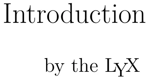
Jagged fonts from my own document Smooth fonts from the introduction

landroni
  • 6,011
detly
  • 3,472

3 Answers3

5

Insert this into the LaTeX preamble (there's a section for that in the document settings):

% set fonts for nicer pdf view
\IfFileExists{lmodern.sty}{\usepackage{lmodern}}{}
detly
  • 3,472
5

To solve the same problem I resorted to install the package cm-super.

Maybe it could be preferable, because you don't need to always remember to put those lines in the preamble.

enzotib
  • 96,093
2

By default the fonts in LyX are bitmap (very long story, don't ask). To avoid this you simply need to select a different set of fonts in Doc > Settings > Fonts. The Latin Modern family should give the same look and feel as CM, only using vector fonts. I like Palatino with Optima (see this rant), but feel free to choose what works best for you.

The LyX FAQ might have some information that you can use.

Kaz Wolfe
  • 34,680
landroni
  • 6,011