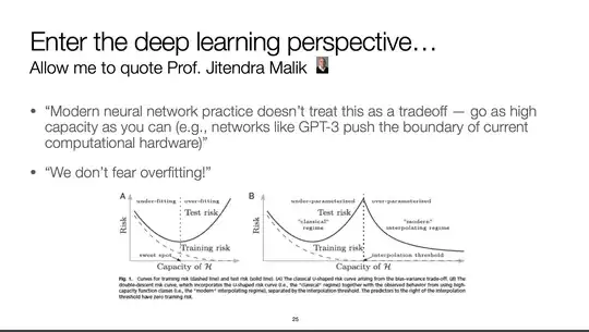
The right plot is about Deep Double Descent, a phenomenon observed in Deep Learning that challenges the classical belief (left plot) in statistical learning theory.
- The first half of the right plot, depicts the classical empirical risk minimization situation in which you seek for the optimal model capacity: the one that balances bias and variance, achieving a low training error and good generalization.
- It has been observed that if you keep increasing the capacity of some model (assuming proper regularization) your training error goes to zero (the interpolation threshold) and, unexpectedly, the generalization (test) error decreases too as the capacity is increased!
- This modern interpolation regime were over-parameterized models actually generalize much better than models with the just-right capacity contradicts the classical view and the bias-variance trade-off.
One explanation for this is that, for DL models variance is not only in the sampling of the data used for training (like assumed by classical ML), but also in the weight initialization, optimization, and training procedure as well. Seems that over-parameterization decreases such variance allowing for better generalization.
